Wardley Mapping
Wardley Mapping charts components by evolution to expose duplication. The evidence is author practice and single cases, with no outcome test.
- Published
- Source
- Simon Wardley
- Evidence
- Case evidence
- Reading time
- 14 min
Short summary
Wardley Mapping plots the components needed to meet a user need on two axes: how visible each component is to the user, and how evolved it is from genesis through custom build and product to commodity. The 2015 post that introduced the method sets out ten steps, grouped as John Boyd’s OODA loop, and argues that the word strategy should stay out of the conversation until a map exists. The decisions it claims to improve are concrete: whether each component should be custom built, bought or consumed as a service, whether another group in the organisation is already running it, and where to direct competitive effort. The evidence offered is the author’s own practice, a TV company map drafted in a few hours, and self-reported consulting counts of duplicate systems. Independent peer-reviewed work adds single cases and worked examples rather than outcome data.
1. Framework origin
Simon Wardley published An introduction to Wardley (Value Chain) Mapping on his blog on 2 February 2015. His author notes state he created the technique in 2005, worked in cloud computing from 2005 to 2010, ran strategy for Canonical from 2008 to 2010, co-authored the Better for Less paper on UK Government IT in 2010, and researches for DxC’s Leading Edge Forum.
The post frames the method as the output of his own experience rather than a research programme. He describes starting as a “newly minted yet confused CEO”, taking a decade to develop the techniques and a further decade to gain confidence through practice. The ten steps are grouped explicitly onto Boyd’s OODA loop, which he calls “probably the only truly universal technique that I’ve found useful”. The Wikipedia entry traces the origin to Fotango in 2005 with further development at Canonical UK between 2008 and 2010, though that article carries maintenance tags for relying on primary sources such as blog posts and tweets.
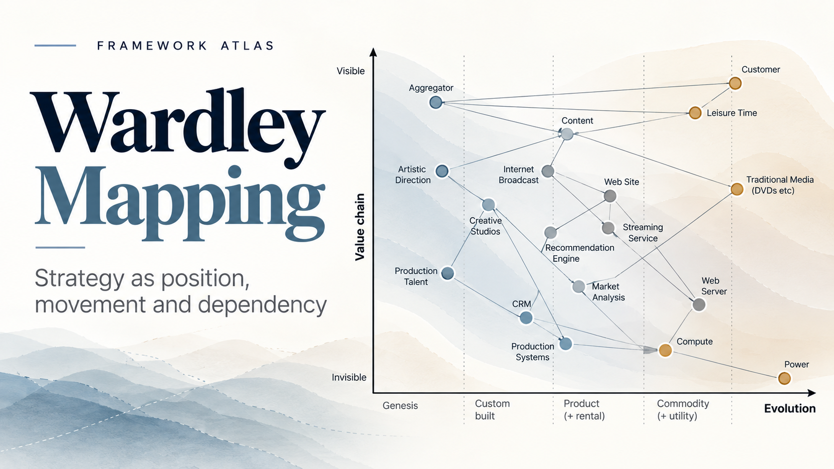
This is the TV company map before any annotation, and it is the clearest view of why the method has the shape it does. Components the user can see sit high, the infrastructure they depend on sits low, and the horizontal position records how evolved each component is judged to be, from genesis on the left to commodity on the right. The dependency lines are the point; nothing here is measured, and nothing yet is marked as something to build or consume.
2. Decision it claims to improve
Two decisions, and they are not the same kind of decision.
The first is build, buy, consume or share. For each component in a value chain, how evolved is it, is another group in the organisation already running something equivalent, and should it be custom built, bought as a product or consumed as a utility. The source’s aggregated view is built for exactly this: comparing maps from different parts of a business, finding the component that appears 13 times, and agreeing that one group builds the rules engine for the other six. This is where the method does most of its work, because the inputs are things a group can actually check.
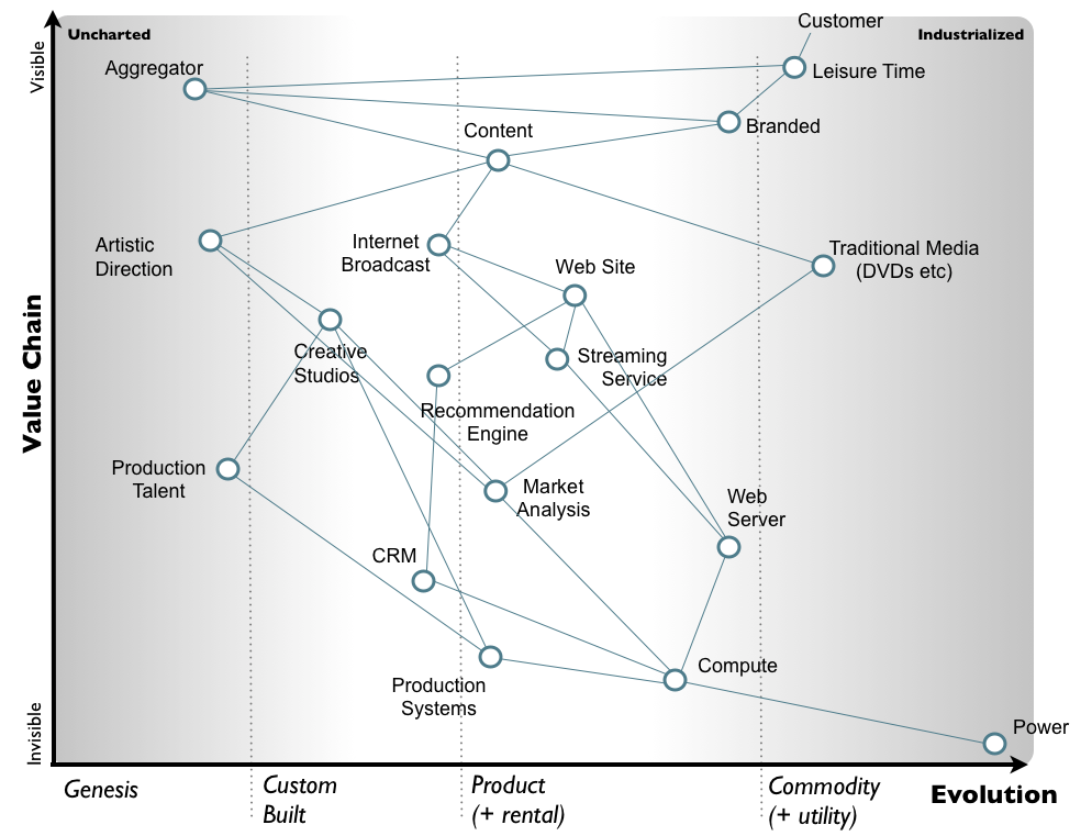
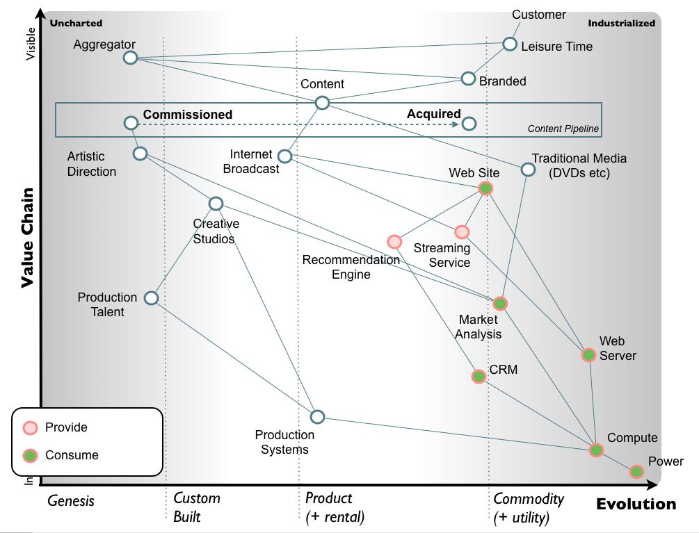
Wardley’s TV company map is annotated for exactly this decision. The pink rings mark components the organisation would provide and the green centres mark what it would consume, and those markers track position on the evolution axis: web server, compute, CRM and power sit in commodity territory and get consumed, while the recommendation engine and streaming service sit further left and get built. The dashed arrow running from Commissioned to Acquired inside the content pipeline is a predicted movement rather than an observed one, and every position on the chart is the author’s judgement about a teaching example, not a measurement.
The second is where to direct competitive effort, which the post calls determining WHERE to attack and then WHY here rather than there. The worked Fool’s mate example attacks production systems with an open source effort in order to commoditise creative studios and bring commissioning costs down. The logic is legible. The support for it is thinner, and the article separates the two accordingly.
3. Evidence base
The source is author assertion plus anecdote, and it says so. Wardley writes that he prefers “not to make grand claims of how much it’s going to save you or how much it’ll improve your strategic play other than to say - a little bit of situational awareness seems to go a long way”, and offers personal trial as the test. That sets the evidential ceiling.
The worked example is a TV company map chosen because “anything of commercial value has long since left it and been exploited or discarded”, drafted in a few hours from no prior knowledge of the industry. It demonstrates how to draw a map, not what happens when you use one. The duplication figures come from consulting practice and are hedged in the text: 13 different implementations of web site, 5 of recommendation engine and 18 of compute hold only “if we take the above aggregated view as typical”, alongside a stated worst case of over 120 implementations of case management in one organisation, and 100 commercial companies spending an annual aggregate of £8-£10 billion customising Financial ERP in identical ways. None of these are audited, and no before-and-after is reported.
Figure 1 is the finished version of that map. Worth noting why it takes the shape it does: user-facing and uncertain components sit high and left, the shared infrastructure they depend on sits low and right, and the dependency lines between them are what convert build, buy or consume into a positional question. The pink and green markers show which components the organisation would provide and which it would consume. Both axes record the author’s judgement rather than a measurement, and nothing here reports what happened after the map was drawn.
What is missing across everything available is an outcome measure. No controlled or comparative study, no head-to-head against value chain analysis, SWOT or scenario planning, and no published check on whether two competent teams mapping the same organisation place components in the same positions. For an instrument roughly two decades old whose two axes both rest on judgement, that last absence is the most informative fact in the file.
Other perspectives
Danny Buerkli (2025, practitioner) names four limits by assertion: maps cannot forecast which novel components will appear at genesis, movement depends on competitive pressure because “in the absence of competition, we would expect components to remain stationary”, a map “can only represent what its creators already know”, and choosing the right segment and resolution relies on tacit judgement. He treats these as properties of any framework and asks whether mapping beats the alternatives for a specific goal.
Matt Edgar (2017, practitioner) makes the sharpest methodological objection: “the x-axis shows not evolution but level of consensus”. He reports a first-hand case at Orange Group where organising around pioneers, settlers and town planners produced turf wars because “each group was incentivised to claim it for their own”, and argues components “flip from commodity to innovation and back again”. He still credits mapping with building situational awareness.
Will Larson (2025, practitioner) rates it strongest for zooming out in dynamic environments and “less helpful in the details”, excludes the doctrine and gameplay layers, and notes it is the technique he has personally used the least. Andreas Zwinkau (2020, practitioner) keeps the pioneers, settlers and town planners structure, finds the ubiquity-versus-certainty explanation of evolution confusing, and points out that Wardley was removed before executing his cloud strategy, so the founding example has no attached result.
The peer-reviewed footprint is thin and supportive. Bagchi and Sharma (2025, The Learning Organization) map one ERP implementation and abandonment retrospectively and state the limit themselves: “While the findings of a single case study offer limited generalizability, this study sets out the approach that can be extended in more complex settings.” Pujadas, Thompson, Venters and Wardley (ECIS 2019) introduce a mapping artefact for situational awareness across horizontal value chains and report evaluating it in the field with practitioners and researchers, with Wardley as co-author; the evaluation method and sample could not be verified from the retrieved file. Kay and Sun (Journal of Medical Education Research) apply it to planning a medical elective as a worked example rather than original data, and the volume numbering on the landing page is internally inconsistent and needs verification.
Wardley’s own follow-up, On Diffusion and Evolution (2015), grounds the certainty axis in “just over 9,000 articles” and Salaman and Storey’s 2002 Innovation Paradox, while stating plainly that “you can’t predict the change over time in this manner”. Reported use at the UK Government Digital Service and on HS2 technology infrastructure rests on primary and self-published accounts, with no independent evaluation found.
4. Where it helps
As a shared artefact for a group that disagrees without knowing it. Drawing dependencies from the user need down to compute and power forces each person to commit to a position on how mature each component is, and once that position is on paper it can be argued with. The aggregated view is the most defensible part of the method: when several teams map the same territory, differing treatments of the same component become visible, which is the precondition for agreeing that one group supplies it to the others.
It is also cheap. The post claims a day or two to reach the Act step and the TV example took hours. At that price the method does not have to be right about evolution to earn its place. It only has to surface duplicate builds and unspoken disagreement that would otherwise stay buried in separate project plans. Buerkli, Edgar, Larson and Zwinkau disagree about a great deal and all credit mapping with building situational awareness and exposing assumptions, which is about as much convergence as a judgement-based framework ever gets.
5. Where it misleads
Two failure modes, both produced by the artefact looking more precise than its inputs.
The first is treating placement as measurement. If Edgar is right that the x-axis records level of consensus rather than a property of the component, a map tells you what the room believes, and Buerkli’s point that it “can only represent what its creators already know” bounds the output by the group’s blind spots. Detractors quoted in the Wikipedia article put it harder, arguing the process can “launder assumptions into facts, delegitimise challenge (and still create consensus)”, which is the inverse of the claimed benefit. Nobody has published a reproducibility check, so there is no way to know how much of a given map is the territory and how much is the mappers. That gap is my main reservation, and it is the one a manager can feel in the room when two confident people place the same component two columns apart.
The second is the jump from map to gameplay. Steps 1 to 5 produce an inventory and a conversation. Step 6 produces an attack. The Fool’s mate example asserts that creative studios are “likely” to back the play and that production system vendors’ inertia “can be easily overcome”, with no reported instance of the play being run and resolved. The directional premise underneath it is contested: Buerkli expects components to stay put without competitive pressure, Edgar rejects unidirectional movement, and Wardley himself treats movement as a probability function.
Two smaller points. The claim that “you can’t remove such duplication without a communication mechanism such as mapping” is asserted without any comparison against a service catalogue or an architecture review board. And the pioneers, settlers and town planners structure arrives bundled with the method; Edgar’s Orange Group experience is a reminder that structure without matching incentives produces territorial behaviour rather than better allocation.
6. Scorecard
| Dimension | Score | Rationale |
|---|---|---|
| Clarity | 8/10 | Two axes and ten steps grouped as Boyd’s OODA loop, carried through ten figures on a single TV company example, so the artefact is easy to draw and easy to show someone. The evolution axis is the weak point: Zwinkau (2020, practitioner) found the ubiquity-versus-certainty explanation long-winded and confusing, and Wardley needed a separate 2015 post to set out where the axis came from. |
| Novelty | 6/10 | The value chain half is familiar territory and the OODA loop is cited directly in the post, with the certainty axis later grounded in Salaman and Storey’s 2002 Innovation Paradox. What is genuinely new is plotting dependencies against component maturity on the same picture so that build, buy or consume becomes a positional question rather than an opinion; the Porter lineage is an interpretation, since the post never cites him. |
| Evidence base | 3/10 | The supplied source offers the author’s own practice, a teaching example drafted in a few hours from no knowledge of the industry, and self-reported consulting counts hedged as “if we take the above aggregated view as typical” (13 web sites, 5 recommendation engines, 18 compute, a worst case of over 120 case management implementations, 100 firms and £8-£10 billion on identical ERP customisations), none audited. Independent peer-reviewed work adds form but not design: Bagchi and Sharma (2025) is one retrospective ERP case whose authors state its “limited generalizability”, Kay and Sun (2026) is a worked elective-planning example, and the ECIS 2019 artefact paper is co-authored by Wardley. |
| Causal strength | 3/10 | Case evidence at best, and no outcome measure anywhere in the file: no controlled or comparative study, no head-to-head against value chain analysis, SWOT or scenario planning, and no published inter-rater reliability check despite both axes resting on judgement. The post itself sets the ceiling, making no savings claim and proposing personal trial as the test. |
| Decision usefulness | 6/10 | The aggregated view does real work on one decision: when several teams map the same territory, duplicate builds and conflicting beliefs about component maturity become visible, which is the precondition for agreeing one group runs the rules engine for six others. The second decision, where to attack, is weaker; the Fool’s mate play rests on asserted reactions (“likely” studio support, vendor inertia “easily overcome”) with no reported instance of the play being run. |
| Practicality | 7/10 | Low cost and low ceremony: the post claims a day or two to reach the Act step, and the worked map took hours, so the exercise can be run without a consulting engagement. Against that, the post concedes “there’s quite a bit to learn about mapping especially in the strategic play area”, and Buerkli (2025) notes that choosing the right segment and resolution relies on tacit judgement, so early maps from an untrained group will be rougher than the timings imply. |
| Risk of misuse | 7/10 | High, because the artefact looks like measurement when it records judgement. Edgar (2017) argues “the x-axis shows not evolution but level of consensus”, Buerkli notes a map “can only represent what its creators already know”, and detractors quoted in the Wikipedia entry say the process can “launder assumptions into facts, delegitimise challenge (and still create consensus)”. Bolted-on doctrine compounds it: Edgar reports pioneers, settlers and town planners producing turf wars at Orange Group because each group was incentivised to claim territory. |
| Overall usefulness | 6/10 | Worth running for the inventory, not the prophecy. Two days to surface duplicate builds and unspoken disagreement about component maturity is cheap enough that the method does not need to be right about evolution to pay for itself, and every source from supporters to critics credits it with that. The score is held down by an evidence base of single cases and self-reported anecdote, untested reproducibility after roughly two decades, and the unsupported leap from map to strategic play, which is where the method is most likely to produce confident decisions it cannot justify. |
Risk of misuse: a higher score means higher risk.
A 6 out of 10 overall reflects a split verdict rather than a middling one. The clarity and practicality scores are genuinely high: two axes, ten steps, a day or two of effort, and an artefact you can put in front of both a board and a project manager. The evidence and causal scores sit at 3 because the method has never been tested against an outcome, and the risk-of-misuse score is high for the same reason the artefact is persuasive, which is that a drawn position looks like a measured one. Read the score as a recommendation to use the first half of the process and treat the second half as a hypothesis generator.
7. Practical use case
Take a health system or a pharma commercial organisation where brand, digital and medical teams are each proposing their own patient-facing portal or symptom checker. Three business cases, three budgets, three sets of consultants, and no shared view of what sits underneath any of them.
Before approving the next build, ask each team to map the same territory independently: the user need at the top, then content management, identity, consent capture, analytics, hosting and compute below it, with each component placed on the evolution axis as that team sees it. Then put the three maps side by side. The useful output is not the strategic play. It is the list of components that appear three times, and the components where one team has placed consent capture as a custom build while another treats it as a commodity service already running in production.
The decision this changes is narrow and checkable: which components get consolidated into one service that the others consume, and who owns it. That part rests on evidence a manager can verify in a week by asking the owning team to demonstrate the running system.
Two practical cautions. Timebox it to the two days the source suggests, because the marginal value of a more beautiful map falls quickly. And keep the gameplay step out of the room until someone can show evidence for the market move being proposed, because a group that has just agreed on an inventory will be unusually willing to agree on a bet it cannot support.
References
- Bits or pieces?: An introduction to Wardley (Value Chain) Mapping, Simon Wardley
- wardleymaps.com
- Where the map ends: understanding Wardley maps’ limitations, Danny Buerkli, 2025
- What do Wardley maps really map? A settler writes, Matt Edgar, 2017
- Refining strategy with Wardley Mapping, Will Larson, 2025
- Wardley Maps (review), Andreas Zwinkau, 2020
- An Introduction to Strategic Planning for the Medical Trainee Using Wardley Maps, Kay AD and Sun R, Journal of Medical Education Research, Vol 4 No 1, DOI 10.5750/jmer.v4i2.2262, 2026
- Building Situational Awareness in the Age of Service Ecosystems, Pujadas R, Thompson M, Venters W and Wardley S, 27th European Conference on Information Systems (ECIS), Stockholm, 2019
- Exploring organizational competencies to implement IT systems using Wardley mapping: a case study, Bagchi SN and Sharma R, The Learning Organization, Vol 32 No 3, pp 418-436, 2025
- Bits or pieces?: On Diffusion and Evolution, Simon Wardley, 2015
- Wardley map, Wikipedia
Source. Bits or pieces?: An introduction to Wardley (Value Chain) Mapping, Simon Wardley.